Hello,  team!
team!
My name is Tom Doyle.
I'm a Web Developer &
Graphic Designer from
Los Angeles, CA.
I've been making websites for just about half of my life, and have been fascinated by the relationship between code and design for as long as I can remember.
I get a lot of joy from my ability to create and am always trying to keep up with new advancements and ways to improve my craft.
Having a tool box is important,
but knowing the right tool to use is imperative.
Tools
- Illustrator
- Figma
- Sketch
- Photoshop
- After Effects
- +bodymovin & lottie
- Webflow
Languages
- HTML
- CSS
- +SASS
- JavaScript
- +ES6+
- +jQuery
- Ruby
- +Rails
- +Jekyll
Skills
- Front End Development
- Web Design
- Responsive Design
- Design -> HTML/CSS Conversion
- Troubleshooting
- Quirks/Compatibility
- Debugging
- Website Optimization
- Email HTML
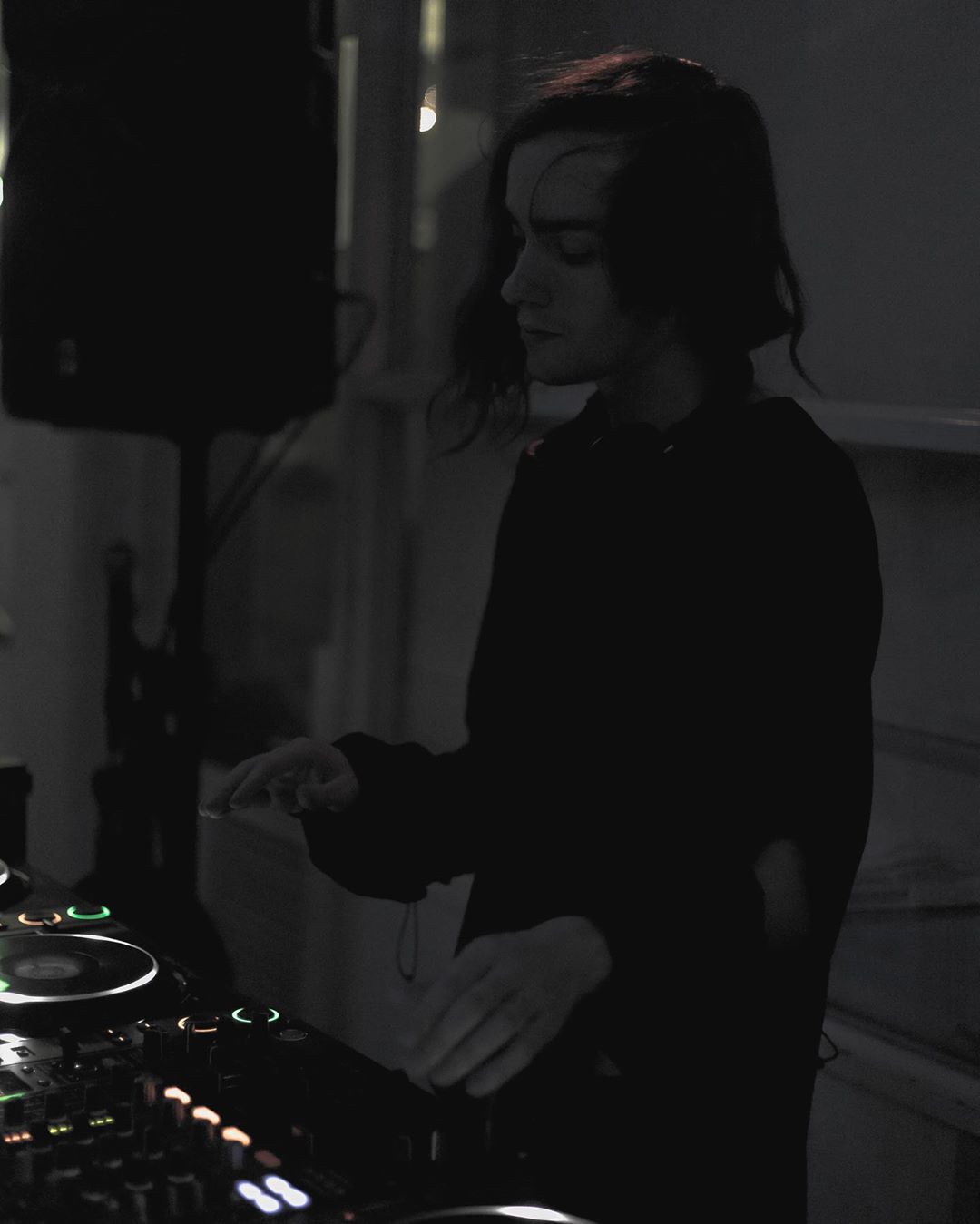
When I'm not making websites, I'm making music.
Music has been a big passion for me for a long time, and during my spare time I enjoy producing and releasing music (and sometimes even play it in front of people!)
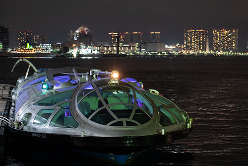
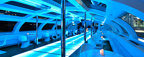
One of my proudest moments happened last year- when I was booked to play all the way in Japan at a venue called Jicoo, a club on a boat that sails through the Sumida River in Tokyo.

Process makes perfect, here is some of my design philosophy
• Design is cyclical. Allow the work of your past inform the work of your future. Always learn.
• Design should be accessible. Understand the mediums and perspectives your work could be viewed from.
• Good design is open-minded. Be open to new methods for problems solving and creating.
• Good design is simple. Don't overthink for the sake of overthinking, let the design speak for itself.
• Design for dev and dev for design. Understanding both sides of the process drives decisions and realistic goals.
Problem solving
I believe problem solving is an important piece of not just my design & development process, but also my in general. I always invite the opportunity to find the best ways to solve a problem, and how to decide what steps to take.
Usually my problem solving process follows an order:
• Look at the problem objectively Boil it down to the root issue and simplify as far as you can
• Try and find more than one solutions Once the task is simpler and disconnected, weigh multiple solutions. Sometimes the immediate answer isn't the best one.
• Bring the solution to the project Once you have your best solution, bring it in to the project and see if it works.
behind the project
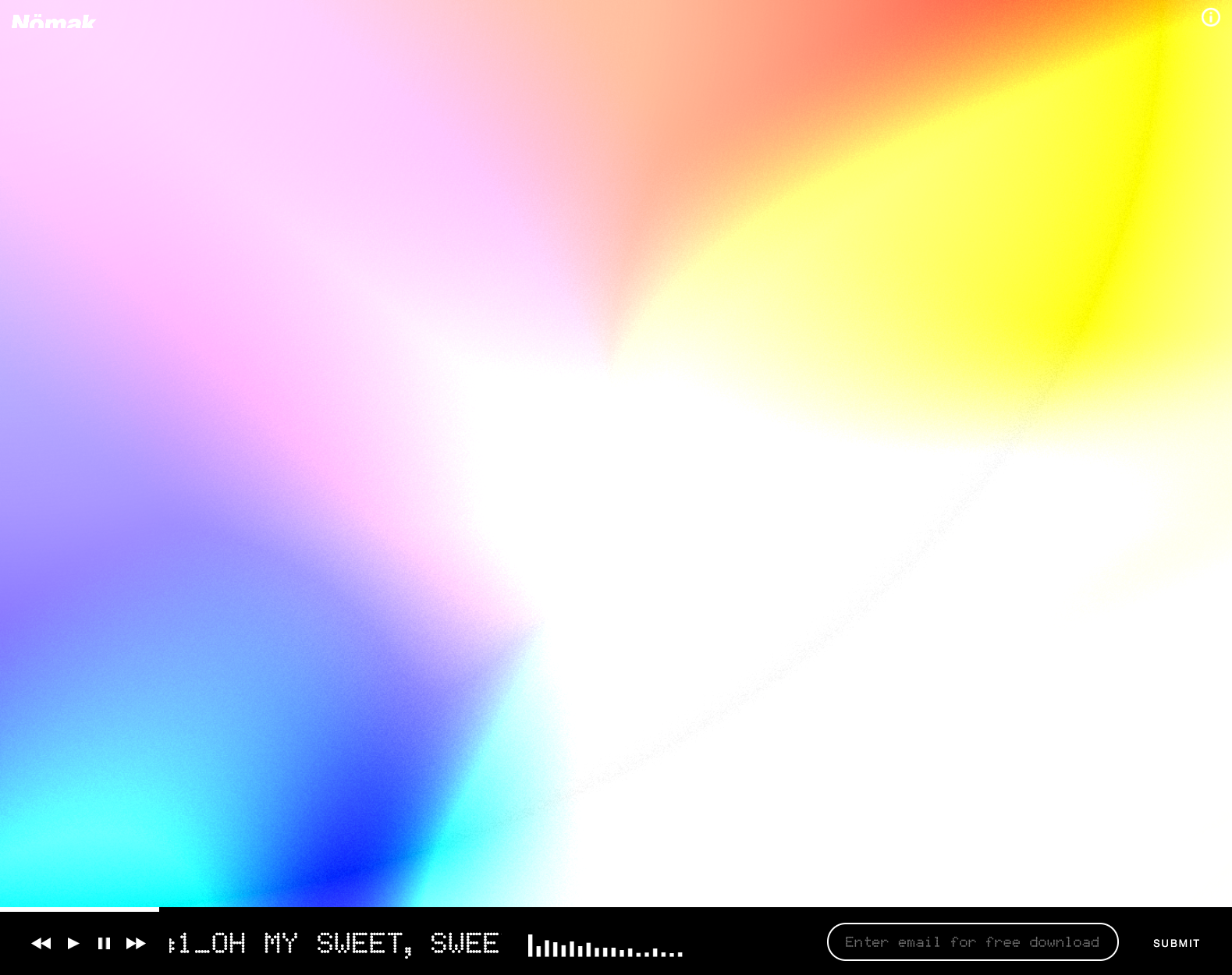
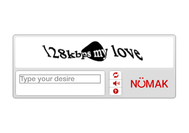
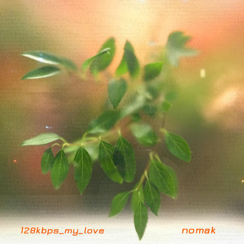
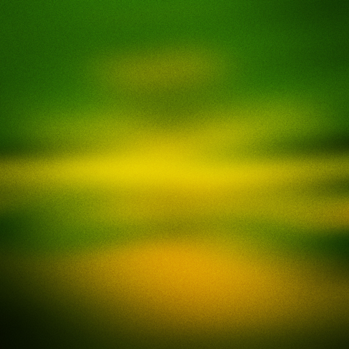
NÖMAK "128kbps My Love" 
Using Web Audio & WebGL to create a living & breathing audio player for French experimental artist NÖMAK.
My Role:
Web Developer & Designer
Goals:
- Spearhead the creation of multiple web pages to promote the album.
- Develop an audio player to allow users a single place to stream the release coherently.
- Create a system to visualize the music in an organic way.
Timeline:
2 Months
- HTML
- CSS
- JavaScript
- Figma
- PIXI.js
- OpenGL Shaders
- Photoshop
- Shopify
NÖMAK "128kbps My Love"
Landing Page
Goal
Create a unique landing page to hold all links and information about the release through the process of announcement.
Concepts
One of the first ideas I had for creating a landing page was a bit unconventional, but I thought the constant question of humanity pitched by anti-spam ReCAPTCHA systems fit the ethos behind the release and the artist's vision of the relationship between increasingly smarter technology and humanity.
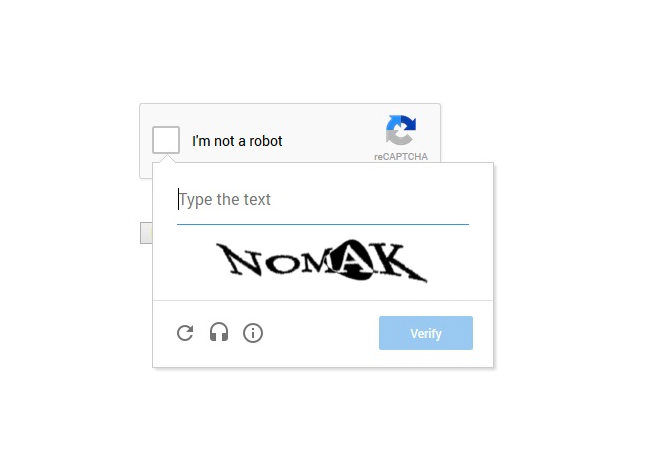
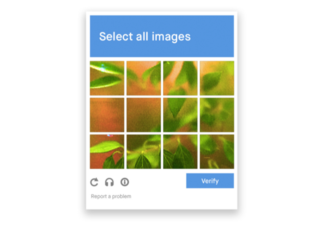
I sketched up multiple concepts reflecting the different implementations of anti-spam in Adobe Illustrator, and decided mutually between the client and I that a "choose an image" concept would fit the use case the best. This concept also was interesting to me because it offered a deeper dual meaning of having a "window in to nature" on the other side of the question.
Development
Once the concept was chosen, I registered a developer account on Google's ReCAPTCHA service and set up a testing page locally where I could test a functional captcha and try to capture the visual quirks and details that I had normally looked over when attempting to get through to whatever laid behind the anti-spam gate. I took notes of design decisions and timing on animations and then got to work recreating the interface in vanilla Javascript and CSS.
Implementation
NÖMAK "128kbps My Love"
Audio Visualizer
Planning
In the initial stages of planning I discussed the project with NÖMAK's management as well as the Graphic Designer who designed the cover for the mixtape. After discussing the meaning behind the release and the artist's ethos she shared her moodboard and design brief for the album cover so I could get get a grasp on the aesthetic choices that lead to the creation of the existing imagery.
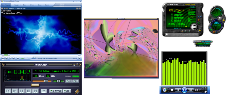
A large focus on this project was combining the synthetic with the natural while also channeling mid-2000s nostalgia, this prompted me to pull in some examples of older MP3 player software to use as design inspiration
Inspiration
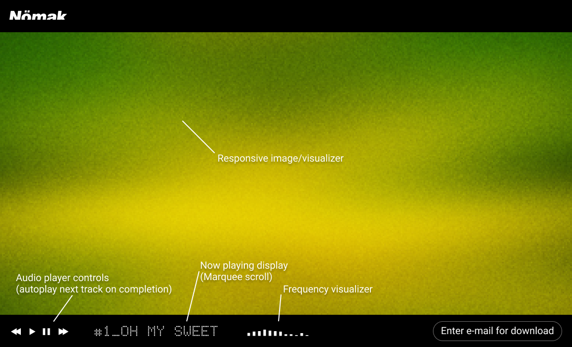
Design
I created the first rough layout in Figma, opting to keep the general style of the actual music player minimal and less pronounced so the visualizer can keep the majority of the visitor's focus
Development
Using the Web Audio API as well as a custom implementation of audio-streaming website Soundcloud's API I coded a custom player capable of streaming the entire album off Soundcloud's system but also providing real time audio frequency data- an important piece for visualizing the audio.
Coding the visualizer came with its own unique set of challenges, the first implementation was visually very rudimentary and worked by compositing images together using an animated displacement map function found in the game engine I had implemented. While this lead to some interesting results, it didn't really pull me in visually compared to some of the prompts and concepts.
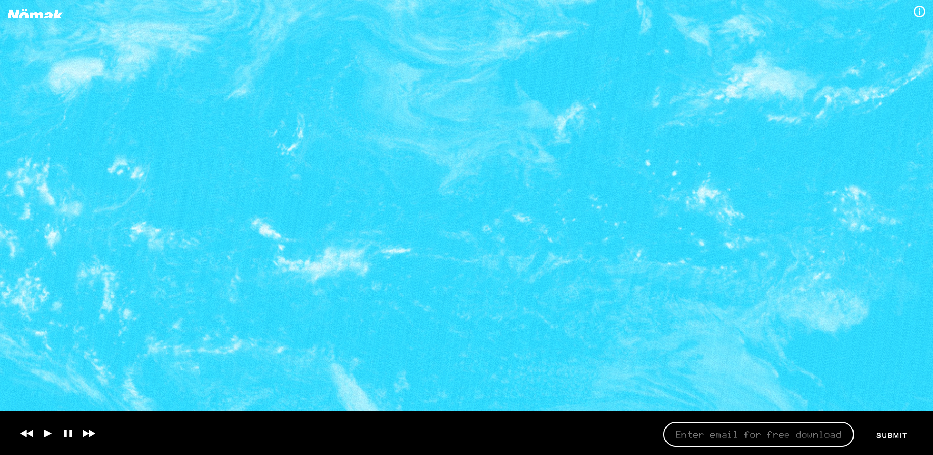
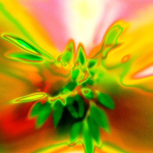
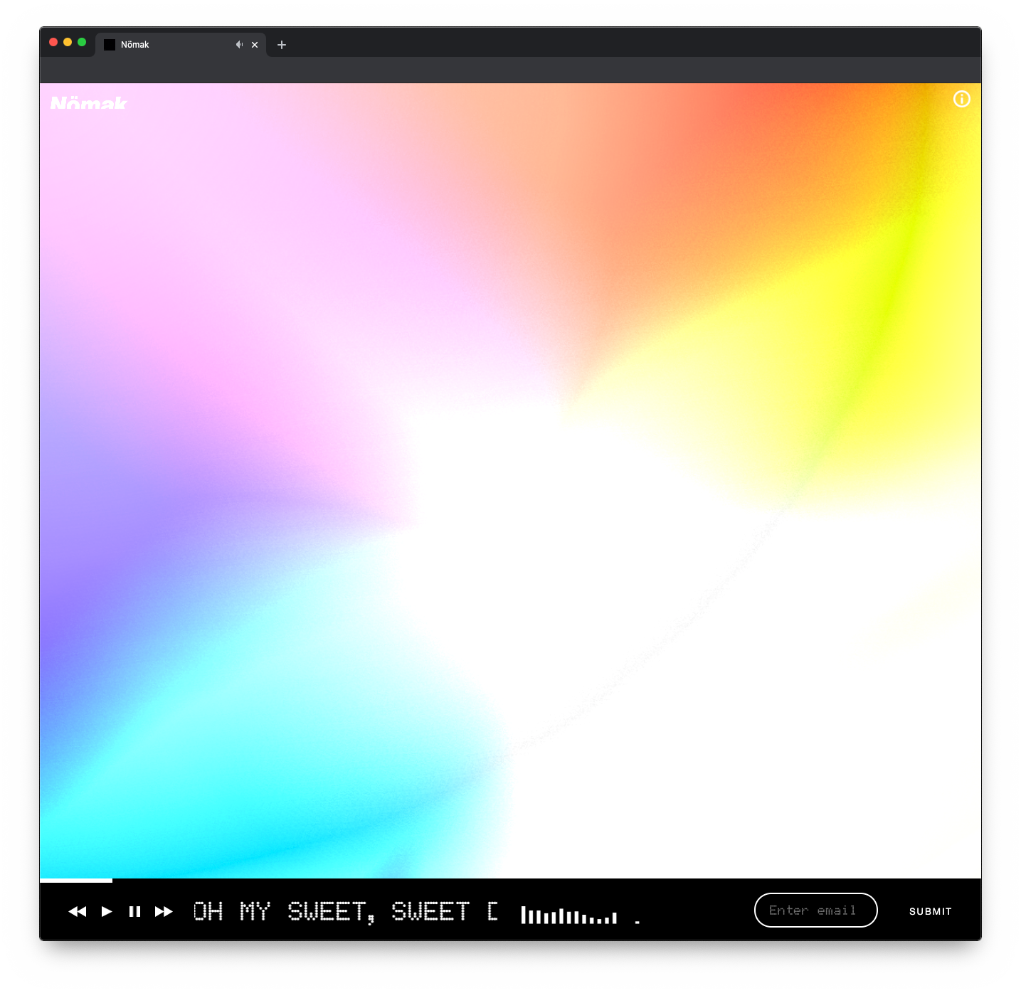
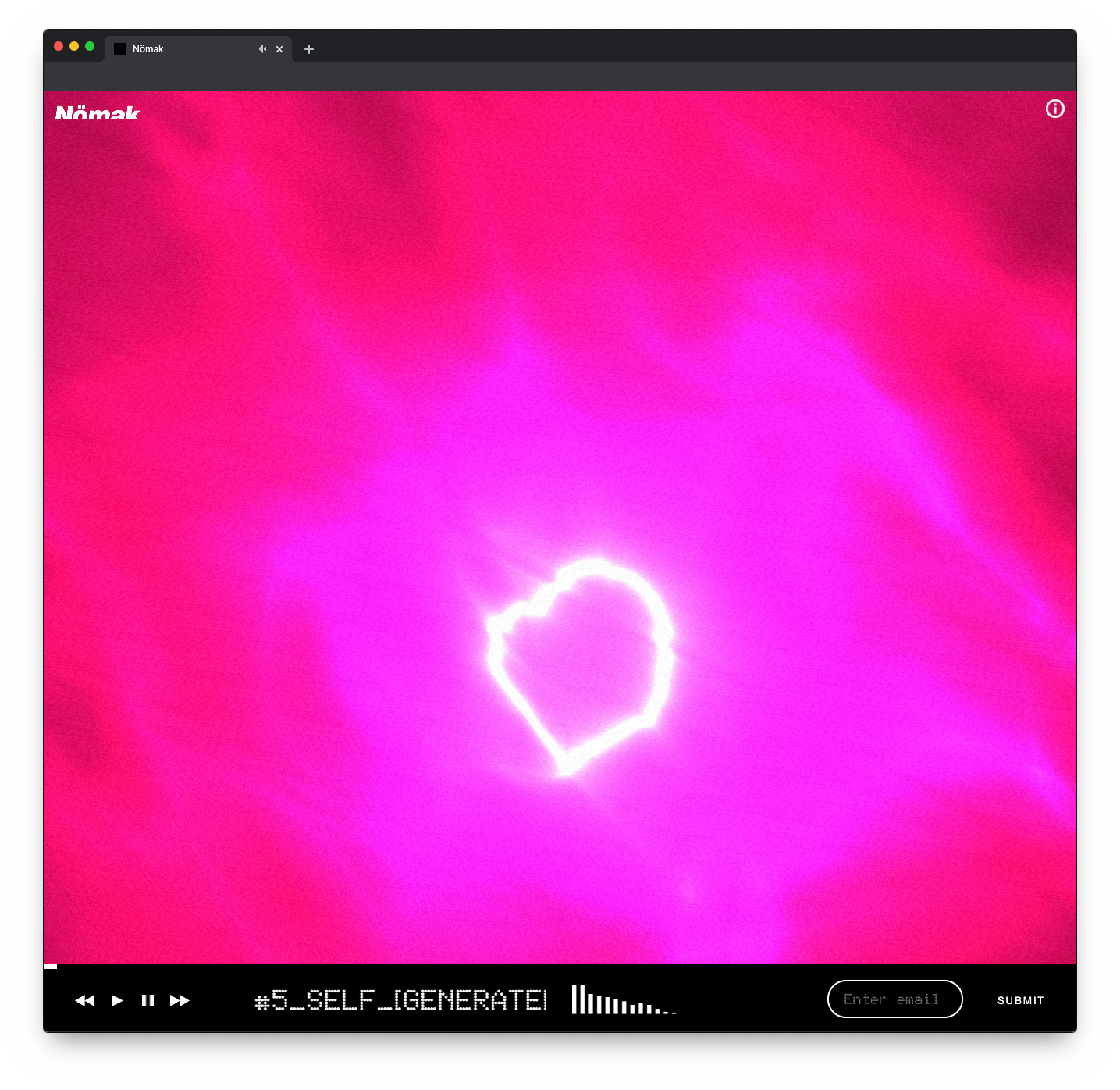
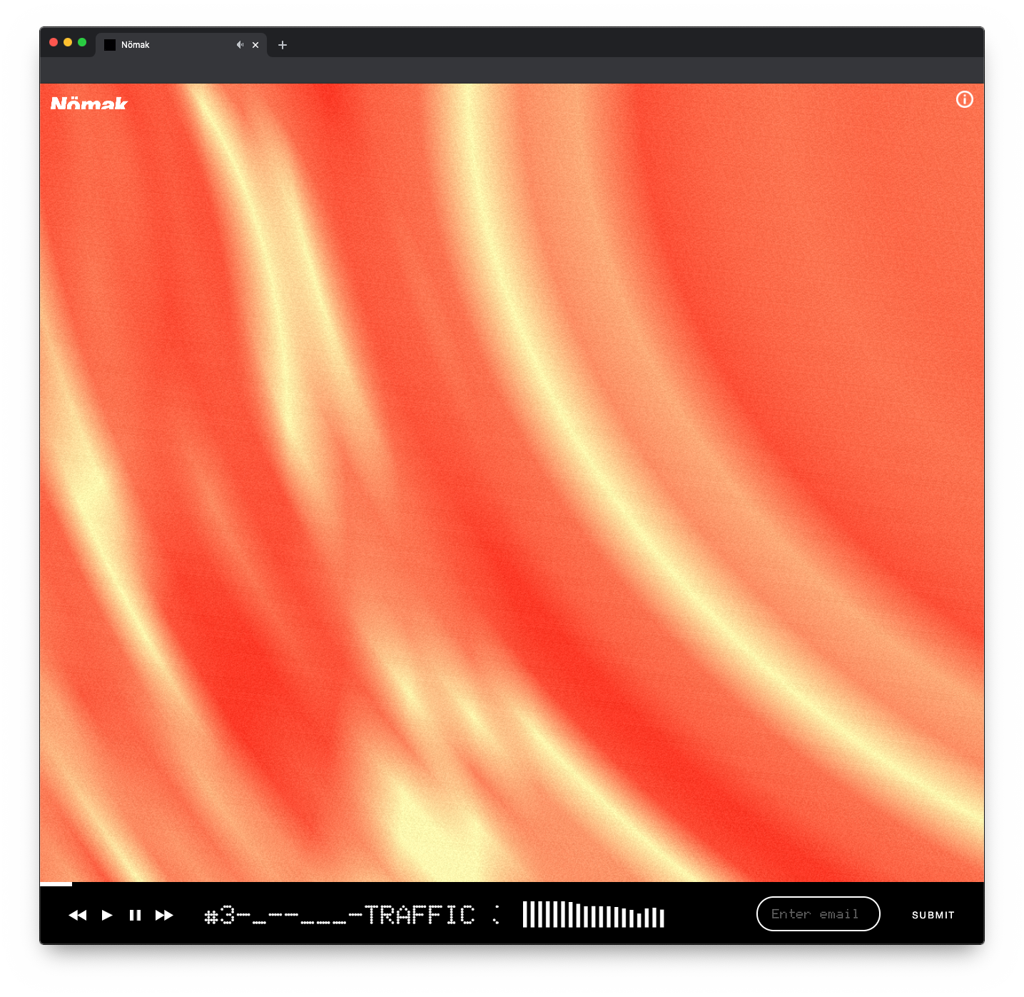
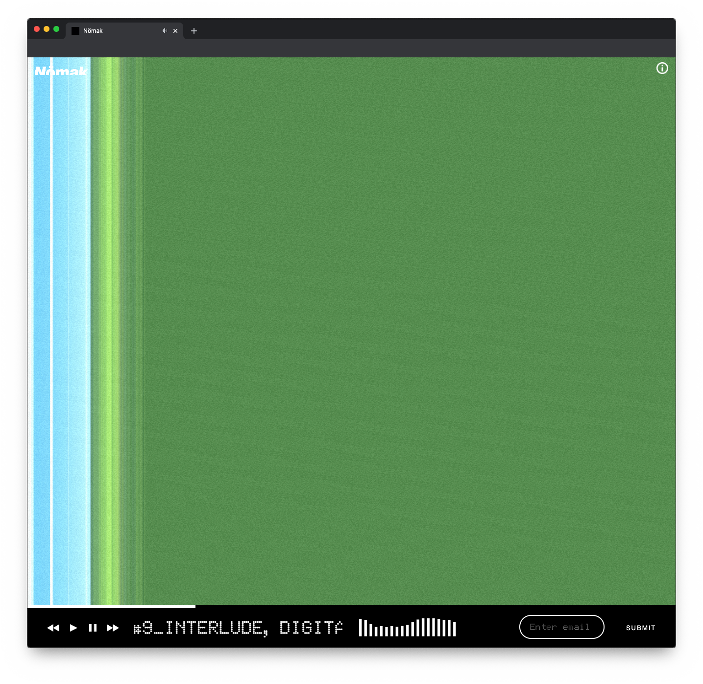
Thats when I did some more research and discovered OpenGL shaders. OpenGL shaders are small programs that, extremely basically, are used to turn inputs in to outputs i.e. create a visual image using math. They are written in GLSL, a simple language syntactically similar to C, which I have experience working with in the past. When learning about this technology and the fact the game engine I had implemented had great support for running them and sending data to and from them I knew this was the way forward to create what would become the visual style for the entire website.
The results turned out great, and I went to work coding a unique shader for each song on the album. The way I described this visual style to the client is "What if you could put audio under a microscope?" Each shader samples either an image or color pallet from stock images of nature, so there is a natural element inside before being thrown through the programmatic math loop, an execution that perfectly matched the spirit of the audio.
Wrapping Up
The website launched on time with all 11 unique visuals, which I also converted in to videos in a myriad of formats to be shared around social platforms for promotion. NÖMAK did not get a chance to see it until launch day due to being away from his computer but applauded me on creating what he described as "the perfect visual manifestation of my album."
Visit "128kbps My Love"
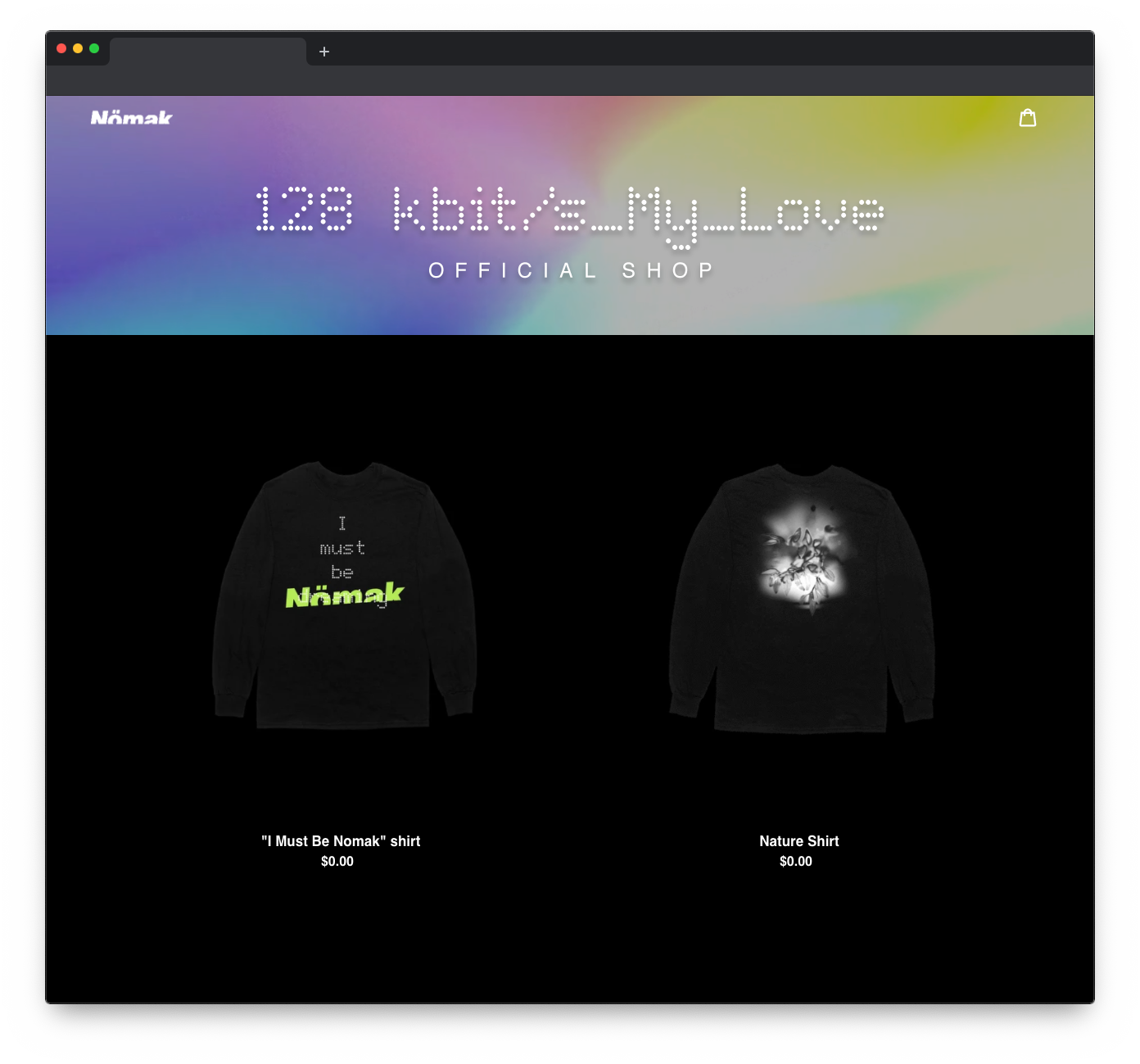
In addition to the website design, I also created a Shopify theme to keep the visual language when linking out to purchase merch
behind the project
Bae Tokyo
Creating an online home for Bae Tokyo built around their existing design language.
My Role:
Web Developer & Designer
Goals:
- Create a revamped homepage for Bae Tokyo.
- Reinterpret existing visual material in to the web medium.
- Make editing and updating the website simple and accessible.
Timeline:
3 Weeks
- HTML
- CSS
- JavaScript
- PHP
- WordPress
- Illustrator
Bae Tokyo
Process
Planning
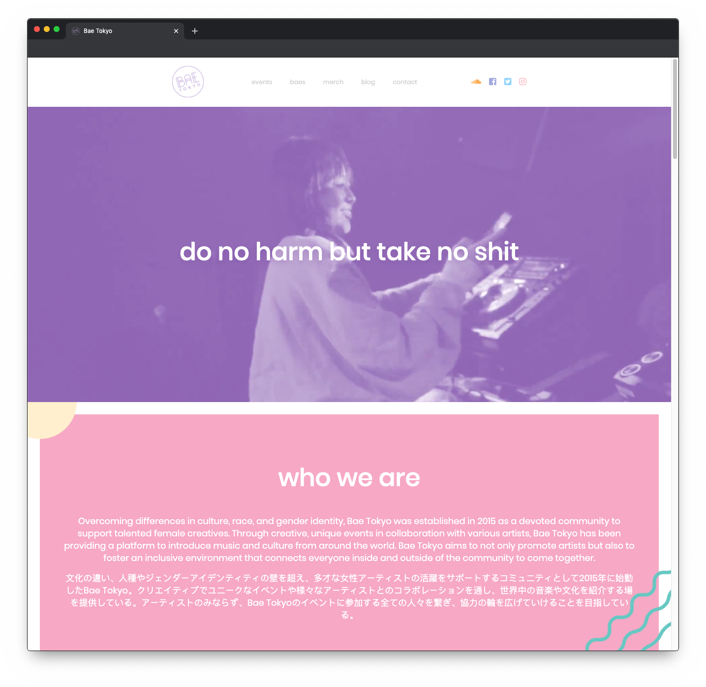
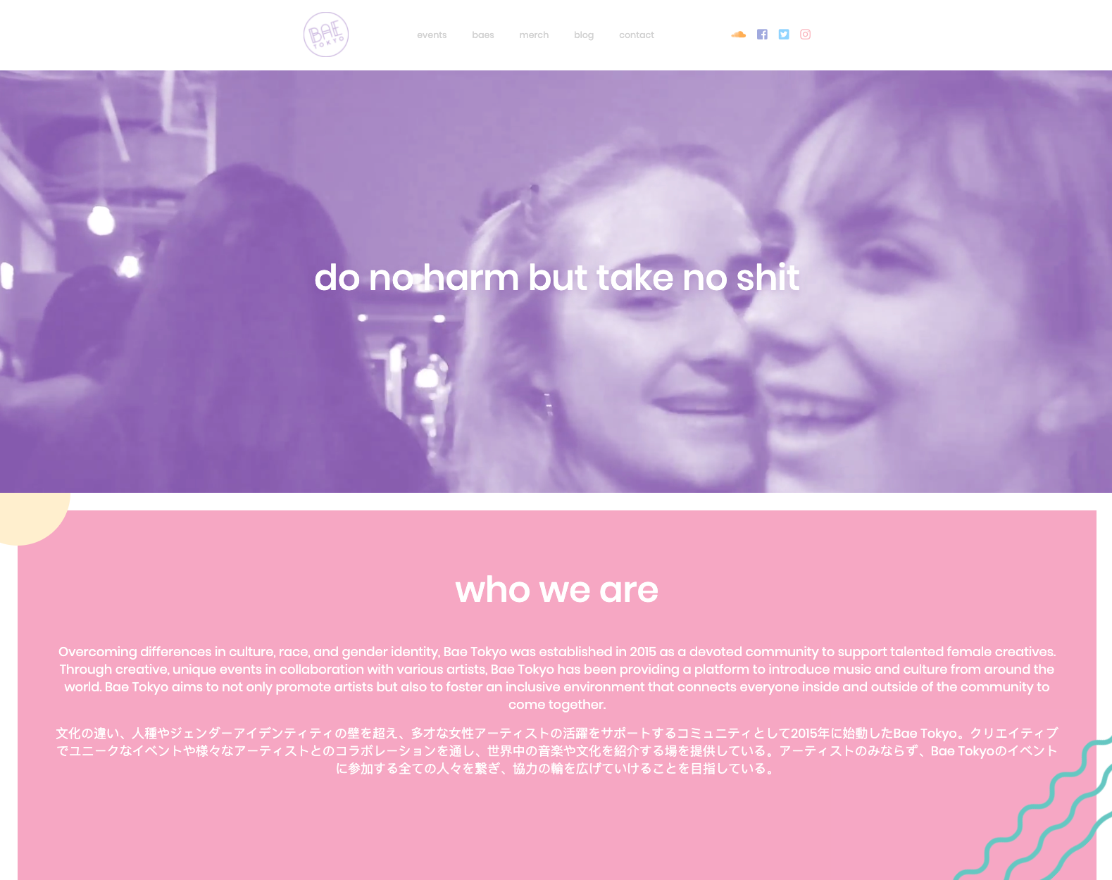
When I first met with Bae Tokyo founder Jayda her website was in shambles, an existing WordPress installation had become corrupted and much of their data had been lost. With an important brand meeting coming up they were in desperate need of a website revamp.
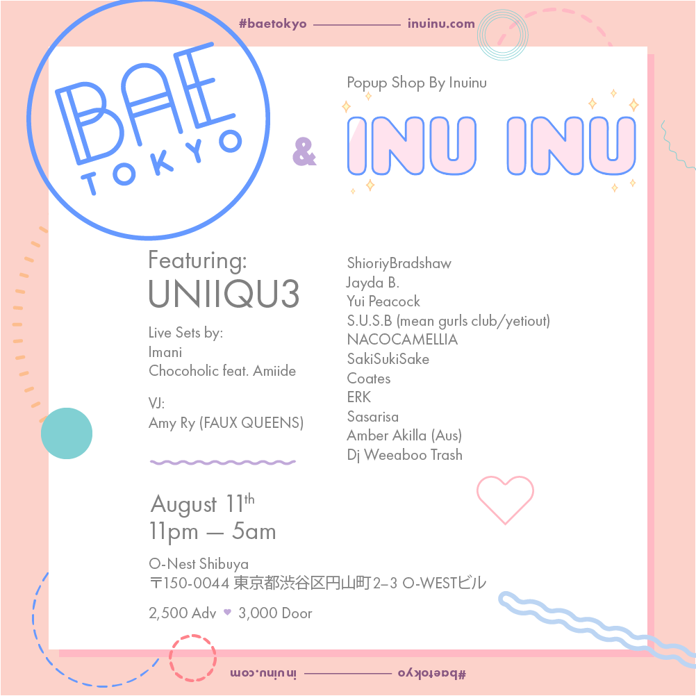
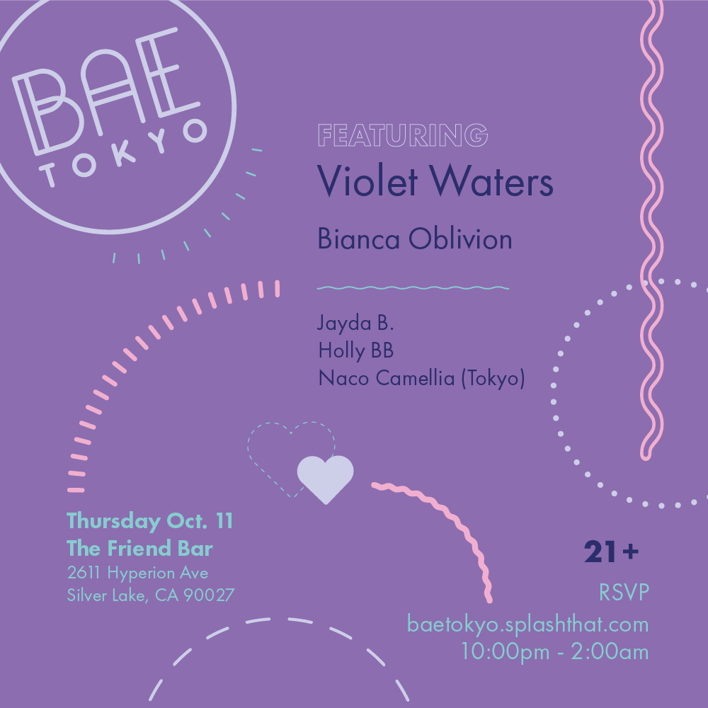
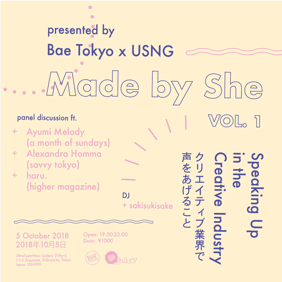
As I was already familiar with their brand as well as their events, I knew their visual design was solid. I talked with Jayda about acquiring any and all visual assets they might have had, she then shared a collection of vector posters/flyers their designer had made.
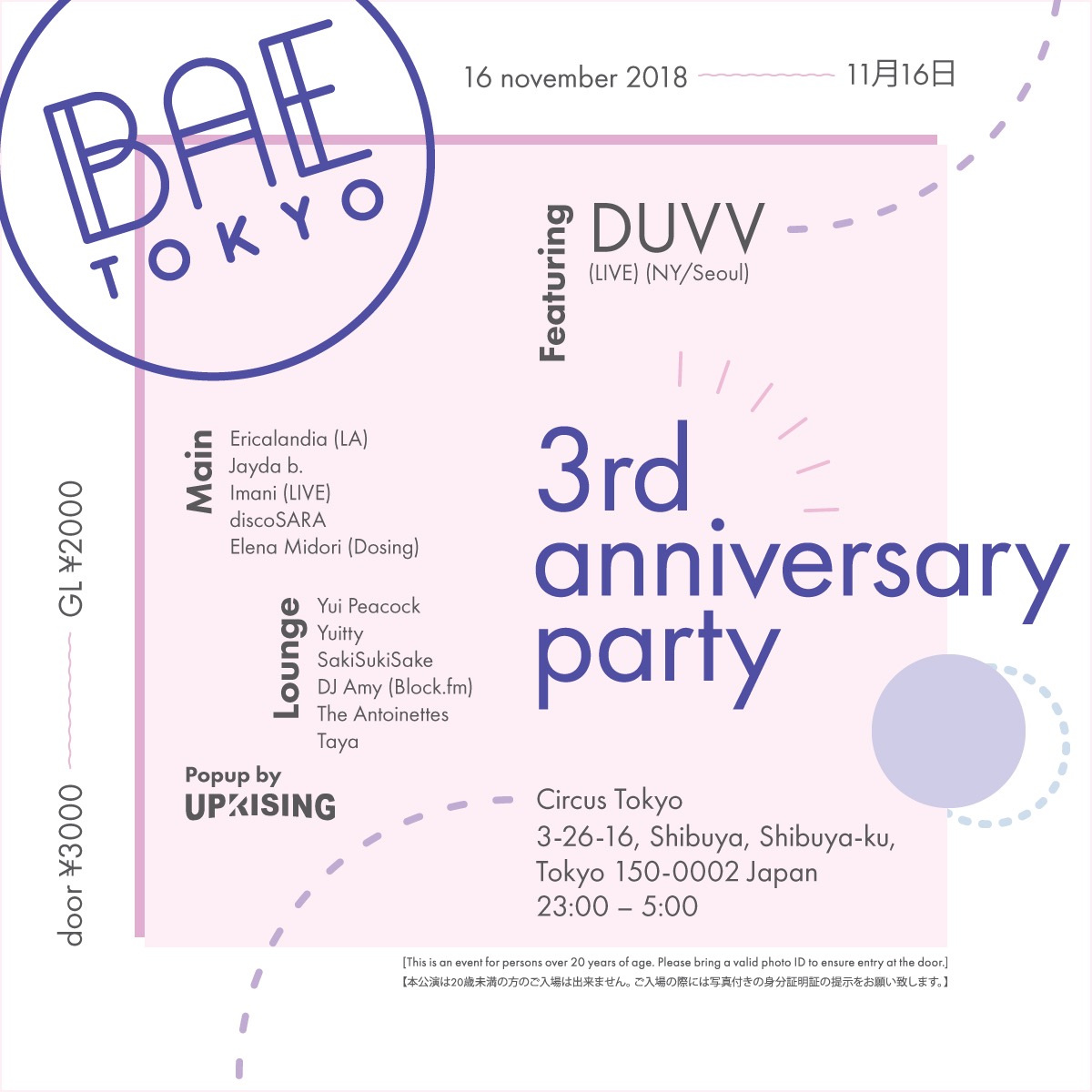
Design
After receiving the design assets, I broke them down to their bare bones; pulling colors, shapes, and layouts from vectors. I used these as a guideline to then create page structure and baseline design of the website.
Once I had these guidelines, it was very easy to get to work. I used a stripped back form of Bootstrap as the center pillar of the website, and as I have made many custom WordPress themes minimal wireframing/concepting was required.
Development
As they were already accustomed to WordPress I opted to keep them with what they were familiar with, but with a new installation with no problematic plugins or a host that would bring them the same data loss issues as their previous one.
In the process of development I realized I could use tools like Archive.org's "Wayback Machine" to recover lost data from an archived version of the site. This was a huge surprise to the Bae team, as they thought it was gone forever!
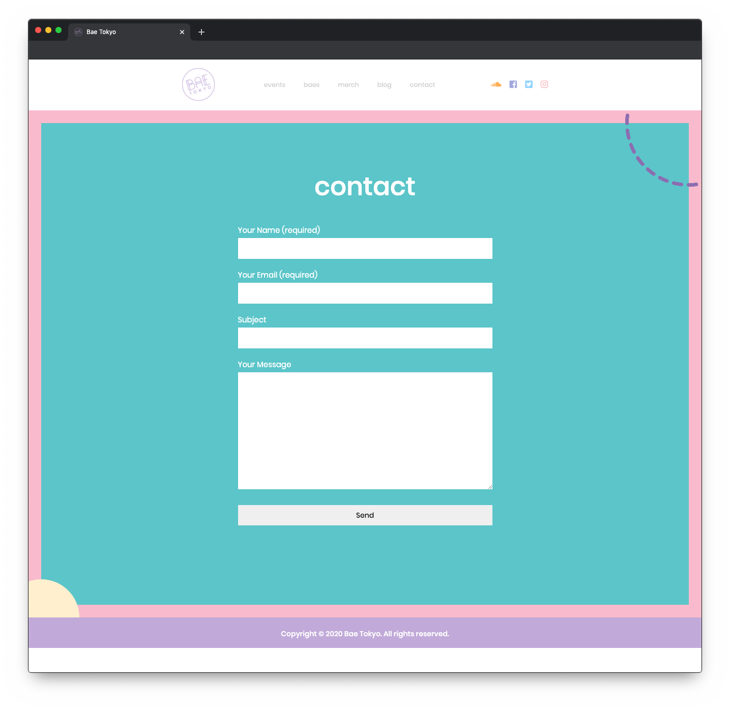
With some custom code in the WordPress theme and some extensions work I added sections throughout the website that can be modified easily. This gives them the opportunity to add content without worrying about where it needs to go or how to order it within a confusing system like their last website version.
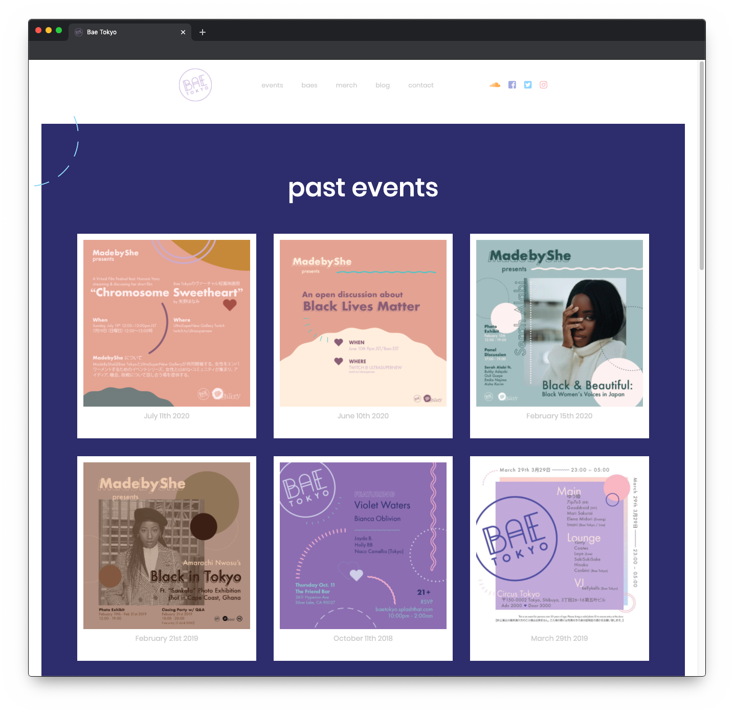
After the majority of the structure of the website was finished I remembered a point of conversation with the founder about always wishing they could work more with animations on their posters, so I decided to utilize some of my keyframe CSS animaton skills to add some animations to graphical elements pulled from the poster
Wrapping Up
The website design was finished right on time for Bae Tokyo to include in their deck while meeting with new corporate sponsors. The Bae Tokyo told me they loved the care and insight I put in to create the perfect website manifestation of their visaul imagery.